Why
Biophilia would like to rebrand, design a new website, and design a couple extra pieces the team can use when out on the field. They want to rebrand because their services are changing and they want to better represent their target audience.
About
Biophilia is a small, women owned elopement planning service based in Lincoln, Ne. They strive to make your special day perfect and stress free. Their team will book all your needs, shop for your decorations through your given inspiration, and create a schedule for your day so everything runs smoothly.
Research
Biophilia would like to target couples that want to travel and gain new experiences through their marriage. Their audience is very adventurous and loves the outdoors, they could spend everyday outside in nature if they could, because it is where they truly feel at home. They also love to go thrifting and turn vintage products into new and meaningful pieces.
The most important tone for this rebrand is earthy, their colors should represent everything in nature from the grass to the beautiful sunsets. They also want a vintage feel to their designs. They want to feel warm and welcoming, and want their designs to feel safe and make their audience feel protected.
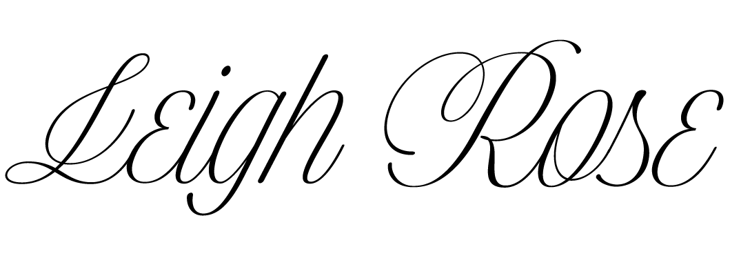
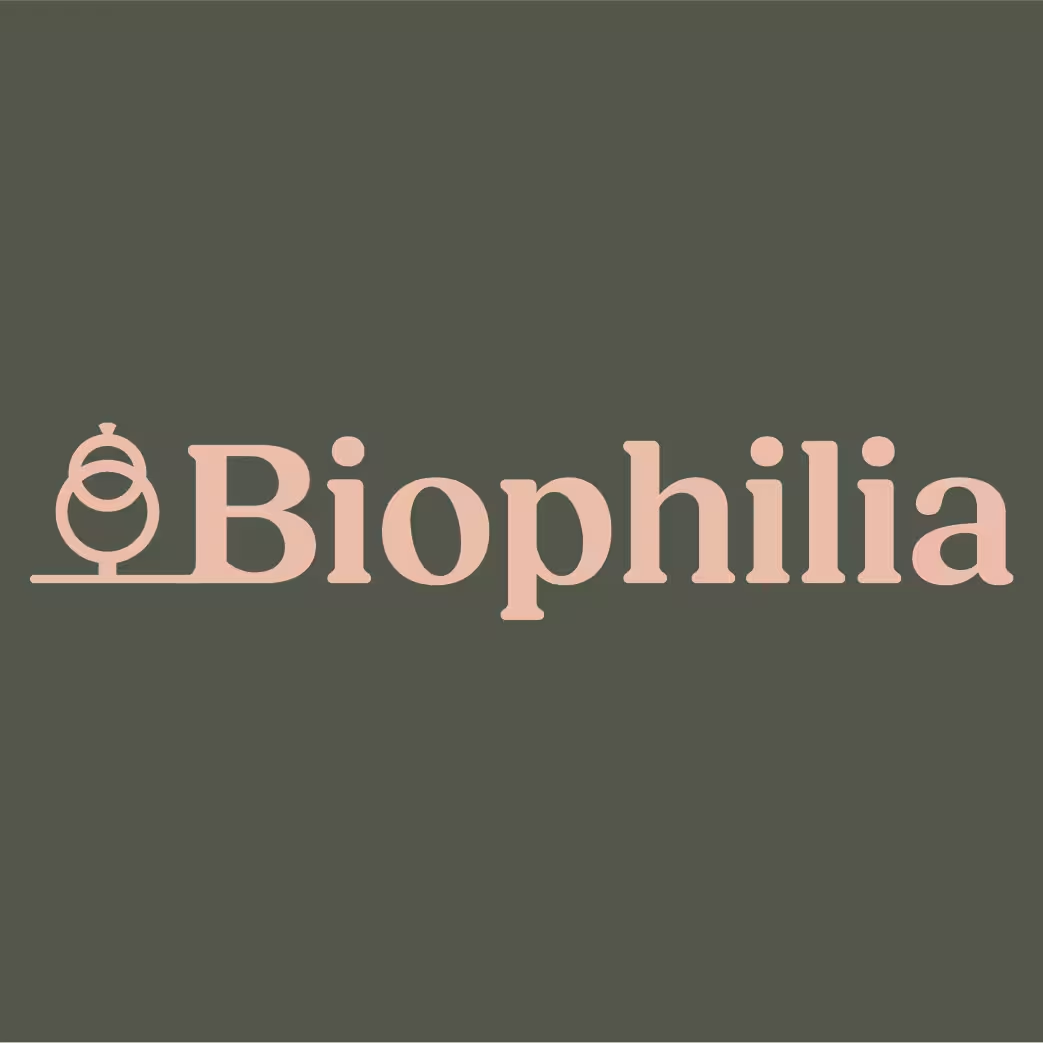
Identity
Biophilia wanted to incorporate a strong earthy feel, they wanted their customers to imagine the nature that would surround them during their elopement. Because of this, I chose greens along with orange and pink colors, these represents the grasses and sunset colors that couples may see.
Their logo is two rings incorporated into one, making them look like a tree. This reminds their audience of marriage in nature. Their word mark gives a safe feel to their brand that reminds their audience that they can trust them.

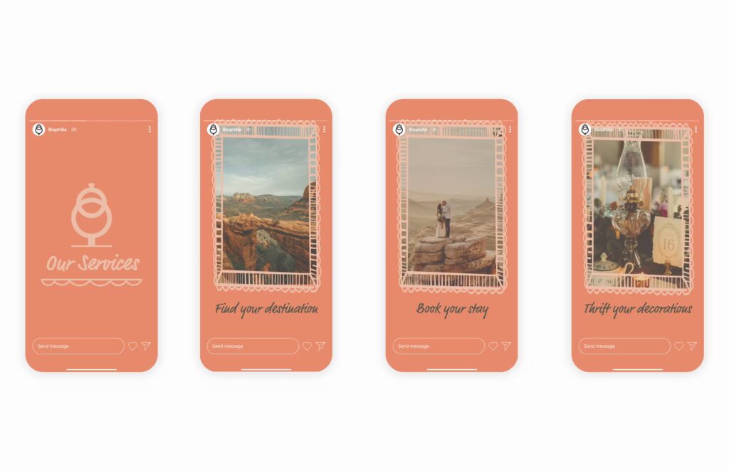
Social Media Stories
My goal for the social media post was to incorporate their vintage feel, along with their warmth and safeness. I designed story posts for their instagram.
To accomplish my goal, I used their warm pinks throughout the designs. The first story is to introduce the viewers to the theme of the stories, their services. The next three are pictures regarding the services they offer with a vintage film feel to it.
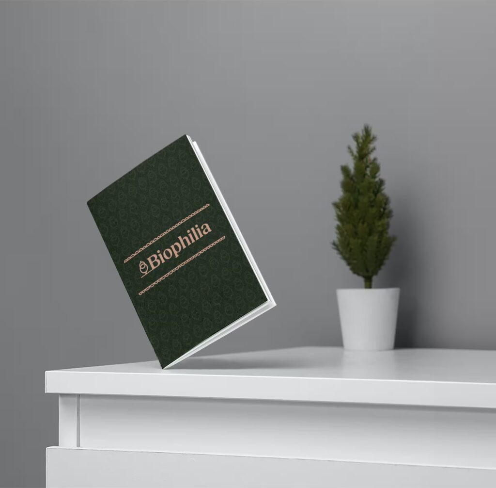
Branding Pieces
My goal for the branding pieces was to incorporate all of their identity into the designs. These pieces will be used mostly by their employees, which will also show off their business.
For all pieces I used high contrast colors to give off a strong contrast, making their logos stand out to catch the eye of potential clients. I made sure to incorporate at least one logo on each piece to represent their business.
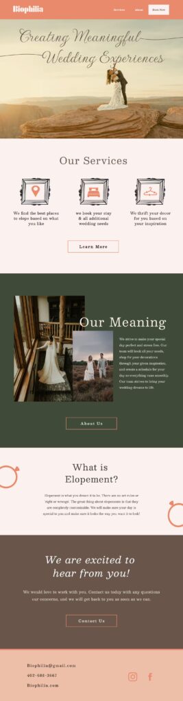
Website design
My goal for the website was to incorporate the vintage and warm tone of their business. I also wanted it to be easily accessible by everyone, making the website easy to click and scroll through.
To accomplish this, I used the warm colors as a base and the greens as accent colors. This makes the website warm and inviting as well as incorporating that earthy feel they desire. I used frames with a vintage feel on different pieces to draw the eye and incorporate the vintage tone.
Scroll to view webpage